03
CSS+JS
Codepen.io
Description
Addition of the much-needed wiggle tag for HTML

Here's a fun one!
Stolen from @kiel.d.m ❤️
It's finally here!
The wiggle tag is finally here, folks! And it's a real doozy!
Let's start out by just making the <w> tag:
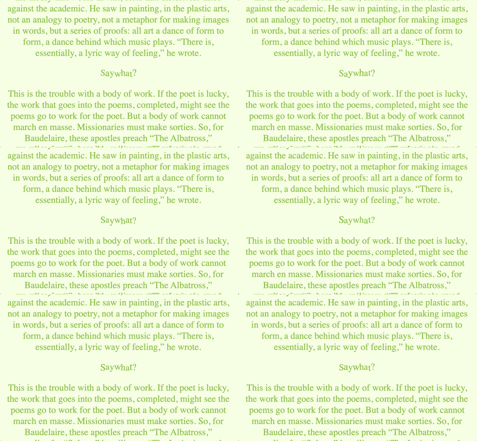
<w>Say what?</w>Look at it in all its glory! But it's not wiggling yet... Let's add some javascript
function wiggleWitIt() {
    // get the all the <w> tags
     wiggles = document.getElementsByTagName("w");

    // loop through each instance
    [...wiggles].forEach((wiggle) => {
      // the new contents of the current wiggle will be...
      wiggle.innerHTML = wiggle
        // the current contents...
        .innerText
        // split by character...
        .split("")
        // then each character wrapped by a span
        .map((char, index) => {
          return `<span style='--animation-order: ${index + 1};'>${char}</span>`;
        })
        // then joined together!
        .join("");
    });
}

document.addEventListener("DOMContentLoaded", wiggleWitIt());
Let's walk through this here. The main function wiggleWitIt() is wrapped by an event listener to check if the page is ready to be manipulated. You may not need it, but it's good to have on a more dynamic or bulky site.
Now to the meat and potatoes of the effect: the wiggle function. We first grab all the elements with the <w> tag and store them in a new array called wiggles.
The general logic of this effect is to take the single string of text inside the <w> tag and split it into individual <span> elements that we can animate separately. If we tried to just animate the <w> tag on its own, the entire word or sentence would shake as a unit, which sucks .
We then do a clean forEach loop (shoutout to JBF for the ES6 update). In this loop we get the current contents.
Inside the loop, we take the current contents, split it by character, wrap each character in a span, then return all that into the <w> tag.
Notice that little `--animation-order` thing we're throwing in there as well. The double dash in front denotes a css attribute. We can actually use that number in our CSS file later. I learned that little trick from CSSTricks .
After running that function, run an inspect element on that <w> tag. You should see something like this:
<w>
  <span style="--animation-order: 1;">S</span>
  <span style="--animation-order: 2;">a</span>
  <span style="--animation-order: 3;">y</span>
  <span style="--animation-order: 4;"> </span>
  <span style="--animation-order: 5;">w</span>
  <span style="--animation-order: 6;">h</span>
  <span style="--animation-order: 7;">a</span>
  <span style="--animation-order: 8;">t</span>
  <span style="--animation-order: 9;">?</span>
</w>
But we aren't wiggling yet!!
To be super performant and fast , we're going to do all the animation using CSS!
w span {
  display:inline-block;
  animation: wiggle 1s infinite;
  animation-delay: calc(var(--animation-order) * 307ms);
  transform-origin: center;
  animation-timing-function: ease-in-out;
}


@keyframes wiggle {
  0% {
    transform: scale(1.0) translateY(0px) rotate(0deg);
  }
  20%{
    transform: scale(1.0) translateY(-2px) rotate(-3deg);
  }
  40%{
    transform: scale(1.1) translateY(-2px) rotate(3deg);
  }
  60%{
    transform: scale(1.0) translateY(2px) rotate(-3deg);
  }
  80%{
    transform: scale(0.95) translateY(-2px) rotate(3deg);
  }
  100% {
    transform: scale(1.0) translateY(0px) rotate(0deg);
  }
}
We set the span tag to inline-block so they all line up next to each other like regular letters, then add this wiggle animation to each one.
The wiggle animation is made up of 6 keyframes, each modifying the scale, Y position, and rotation. The transform attribute is extremely fast across all browsers and allows us to modify multiple values at the same time!
Notice how we use the --animation-order variable to affect the animation delay! This allows us to stagger the start of the animation loop so each letter appears to be wiggling in a different way than the letter before or after.
I set the delay multiplier to an odd number like 307ms so it never lines up perfectly with the 1s animation duration. This gives it a more random feeling, even though we're just looping though 6 keyframes over and over.

👨💻 with ❤️ by spiritual.engineering